
Presentation Drawing
The importance of presentation drawing.
Presentation drawing, also known as a rendering, is a crucial aspect of the design process. It's a means of visually communicating ideas to clients, colleagues, and contractors. Presentation drawings can take many forms, from quick sketches to highly detailed, realistic illustrations. Regardless of the format, the goal of presentation drawing is to convey the essence of a design in a visually compelling way.
The Types of Presentation Drawing
There are several types of presentation drawing, each with its own unique strengths and weaknesses. Here are four of the most common types of presentation drawing:
Sketches are quick, informal drawings that are used to explore ideas and communicate concepts. They are typically done by hand using pencil or pen and paper. Sketches are valuable because they allow designers to express their ideas quickly and without the need for expensive tools or software. That said, sketches are generally less polished than other forms of presentation drawing, so they may not be suitable for more formal presentations.
Concept Drawings
Concept drawings are more detailed than sketches and are intended to convey a more developed idea. They are still relatively informal, but they often incorporate color and shading to give the drawing depth and texture. Concept drawings can be done by hand or using digital tools like Photoshop or SketchUp.
Renderings are highly detailed, realistic illustrations of a design. They are typically created using 3D modeling software and are intended to give clients and colleagues a sense of what a finished project will look like. Renderings are often used in marketing materials and presentations because they are visually impressive and highly detailed.
Construction Documents
Construction documents are highly technical drawings that are used to communicate specific details about a project to contractors and builders. They include things like floor plans, elevations, and sections, and they are typically created using a combination of hand drawing and computer software.
Tips for Effective Presentation Drawing
Regardless of the type of presentation drawing you are creating, there are a few tips that can help ensure that your drawing is effective and communicates your ideas clearly.
Focus on Legibility
One of the most important aspects of presentation drawing is legibility. Your drawing should be easy to read and understand, even when viewed from a distance. Make sure that you use a font size and style that is easy to read, and avoid cluttering your drawing with unnecessary details that can distract from the main ideas you are trying to convey.
Choose the Right Format
Different types of presentation drawing are better suited to different formats. Sketches, for example, are best presented on paper or on a whiteboard. Renderings, on the other hand, are best viewed on a large screen or printed out at a high resolution. Make sure that you choose the right format for your drawing to ensure that it is presented in the most effective way possible.
Use Color Wisely
Color can be a powerful tool in presentation drawing, but it must be used wisely. Too much color can be distracting, while too little color can make your drawing look flat and lifeless. Use color to highlight important details and to create depth and texture in your drawing, but be sure to use it sparingly.
Be Consistent
Consistency is key in presentation drawing. Make sure that your drawing is consistent in terms of scale, proportion, and style. This will ensure that it is easy to read and that your ideas are communicated clearly.
Practice, Practice, Practice
Finally, the best way to improve your presentation drawing skills is to practice. Take the time to practice drawing different types of illustrations, and experiment with different tools and techniques to find what works best for you. The more you practice, the better you will become at conveying your ideas visually.
The Bottom Line
Presentation drawing is an essential aspect of the design process. It allows designers to communicate their ideas in a clear and compelling way and is crucial for getting buy-in from clients, colleagues, and contractors. Whether you're creating quick sketches or detailed renderings, there are a few key principles to keep in mind that can help ensure that your presentation drawing is effective and communicates your ideas clearly.

Leave a Reply Cancel reply
Your email address will not be published. Required fields are marked *
Save my name, email, and website in this browser for the next time I comment.
Exploring the most sophisticated spatial concepts from across the globe. Discover innovative building techniques and materials available, worldwide.

The 4 Basic Principles of Presentation Design
Hacks for sustaining your business..

Scott Schwertly
old-articles/April2020/r2Pgtv0Zq0Et6BY7lGBN.jpg
Source: SlideShare

Creating a beautiful presentation requires a symphony of visual elements to work together for a "big picture." Designers seek to make the entire vision work together in terms of how each part interacts. This includes layout, typography , and imagery , which all add up to a cohesive set of design elements. So, how can you orchestrate the chaos of design in your next presentation? Use the principles below to guide your way.
There are two types of balance: symmetrical and asymmetrical.
Symmetrical Balance: With this type of balance the elements on both sides of the design are in similar location and size. If you were to draw a line down the middle of a symmetrical design, it would be a mirrored image on both sides. An example of this would be the human face.
Tip: You can use this technique by making sure lettering, images, and other elements are aligned and equally weighted on both sides of a slide.
Asymmetrical Balance: Each side of the design is different, yet still balanced. For example: You could have one large box on the left side and several smaller boxes on the right. This kind of balance creates a more visually intriguing dynamic on a slide.
Tip: Incorporate asymmetrical design by using larger visual elements in one area of the space, until the place you want the viewer to focus on is featured.
2. Emphasis
It is important to have some element of your design that stands out and grabs the attention of your audience. You can do this by using the size, color or placement of the object to increase the focus on a certain part. To select the element of design to emphasize, ask yourself: What is the most important feature of this slide?
Tip: In order to add emphasis, make your text bolder, an image larger or use a color brighter than your base.
Your design should always feel unified so that all of your slides are connected together visually, and your deck has a consistent look and feel. The elements on your page must relate to one another through design elements such as color, shape, texture and so on. For example, if the elements on the page feel like they were placed without purpose, then your design will feel scattered, and your audience will likely be confused about the tone of your message.
Tip: Study color theory , typography and the balance principles detailed above to ensure that all of the elements flow together to create a cohesive design.
4. Movement
Designers often use curved lines to instill a sense of motion , and to encourage the eye to move sequentially from one point to the next. This can be an important tool when you are trying to move an audience through a story, or present a series of information on a slide.
Tip: Try using a curved line that moves through your text, from image to image or even slide to slide. Curved lines are also great for creative chart layouts. Ditch the standard chart designs for a layout that utilizes curved lines to draw eyes to your various points.
Putting It All Together
Developing an eye for these different design elements can be learned, and there are plenty of resources online that can help guide you along. Think of the overall elements of design as a way to edit down the visual pieces of your existing presentation in order to organize and make them more cohesive. Next time you work on a presentation, go through this list and check off the elements it has. Then, try to incorporate any missing pieces in your next draft. You’ll be thinking like a designer in no time.
In a time where ideas matter more than ever, we create consistent purpose-to-impact solutions and elevate brands to build meaning and reach their highest potential.

Barter your services
Lorem ipsum dolor sit amet, consectetuer adipiscing elit, sed diam nonummy nibh euismod tincidunt ut laoreet dolore magna aliquam erat volutpat. Ut wisi enim ad minim veniam, quis nostrud exerci tation ullamcorper suscipit lobortis nisl ut aliquip ex ea .commodo consequat. Duis autem vel eum iriure dolor in hendrerit in vulputate velit esse molestie consequat, vel illum dolore eu feugiat nulla facilisis at vero eros et accumsan et iusto odio dignissim qui blandit praesent luptatum zzril delenit augue duis dolore te feugait nulla facilisi

Expand to nearby countries

Adapt to new markets

Work with local suppliers

Cultivate a culture of gratitude
Get personal

REQUEST A QUOTE

Commercial bank tower, West Bay, 15th floor, Doha, Qatar PO Box 27111 + 974 50 239 329 [email protected]

Jewellery & Gemplex 3, DMCC, Dubai UNIT NO: 30-01-416 +971 50 103 7172 [email protected]

SHOLY CENTER - 9TH FLOOR ABI LAMAH ST. NEW JDEIDEH BEIRUT +961 81 540 283 [email protected]

34 Avenue Des Champs Elysées 75008/Paris, Paris, FRA +33 1 40 75 74 51 [email protected]

SHOLY CENTER - 9TH FLOOR ABI LAMAH ST. NEW JDEIDEH BEIRUT +961 1 878 004 +961 81 301 157 [email protected]
DUBAI - DMCC - JEWELLERY & GEMPLEX 3 +971 50 103 7172 UNIT NO: 30-01-416 [email protected]

LEVEL 18, AL FAISALIAH TOWER KING FAHAD HIGHWAY OLAYA DISTRICT, RIYADH, KSA + 966 53 490 5648 [email protected]
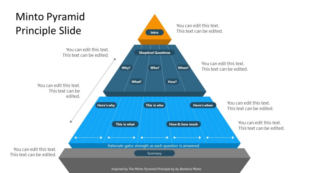
Home Blog Presentation Ideas Guide to Presenting Using the Pyramid Principle
Guide to Presenting Using the Pyramid Principle

The conventional method for presenting a PowerPoint presentation entails reflecting upon the facts and fine details to draw the audience towards a conclusion. This can result in a lengthy Q&A session at the end of the presentation, where the audience might appear confused, unsatisfied, and at times, feel manipulated into being led towards a conclusion of the presenter’s choosing. A better alternative can be to use the Pyramid Principle .
Present using the Pyramid Principle: An Excellent Tool to Communicate Logical Information
The Pyramid Principle can be used for structuring communication to have a meaningful impact. Whether you’re making reports, delivering a presentation, or preparing an analysis, the Pyramid Principle can be an excellent tool to communicate logical information . The structured format in which the communication relays the answer prior to facts and data can help create an environment where critical thinking can be stimulated at the very start, instead of the end.
What is the Pyramid Principle?
Developed by an ex-McKinsey consultant, Barbara Minto, the Pyramid Principle is considered as one of the most important concepts of executive communication often taught in strategic communications and leadership programs . Unlike conventional modes of presenting information, the Pyramid Principle presents the answer at the beginning, followed by supporting arguments, data, and facts. The concept was documented in her book published in 1985 titled; The Pyramid Principle: Logic in Writing and Thinking .
The information is presented in the form of a pyramid, with the core idea at the top, which is then broken down by revealing fine details. The top of the pyramid contains the answer, which is the starting point. The middle of the pyramid represents supporting arguments. Whereas the bottom of the pyramid gives the supporting data and facts.
What are the 3 Rules When Creating Pyramid Structure?
When sitting through a lengthy PowerPoint presentation bloated with facts and data and a leading conclusion, one can feel unsatisfied with the presenter. However, when given the answer at the very beginning, you might feel a need to think through its merits from the very start. As you are presented with supporting arguments and facts, you can determine whether you agree or disagree with the statement or feel a need to raise important questions.
This approach makes it possible to aid structured thinking and stimulate critical thinking at the very start of a presentation or when reading through a report or research. Rather than feeling that you are being led towards a conclusion with convoluted information.
Supporting Arguments
Once the audience has been given the answer or hypothesis at the start, they can begin critically analyzing the supporting argument that follows. This is the second stage of the Pyramid Principle, where the answer is supported with relevant arguments to help test the validity of the hypothesis or to present it for critical analysis.
Supporting Data and Facts
Unlike conventional approaches to presenting data, the Pyramid Principle makes it possible to see supporting facts and data after a hypothesis. Rather than wondering what the long bits of information might be leading to. The one reading through the information or sitting in the audience does not need to wonder about the suggested conclusion, as it has already been presented at the start. Enabling critical analysis of the data and facts, as they are presented.

Why Does the Pyramid Principle Work?
Before the Pyramid Principle, Barbara Minto developed the MECE principle in the 1960s, which is a grouping principle that separates items into subsets. These subsets are mutually exclusive and collectively exhaustive, hence the name MECE. This concept underlies what was later known as the Pyramid Principle during the 1980s. Providing a mechanism to structure information for maximum impact. Making the principle practical and useful.
The Pyramid Principle suggests that ideas should be presented as a pyramid. Using the pyramid structure, the information is grouped together with similar, low-level facts, drawing insights from the similarity, and forming a group of related insights.
How is the Pyramid Principle used for Effective Writing?

Effective writing produces content that is clear, accurate, and concise. The writing is focused, coherent, correct, supporting the central idea. When incorporating the Pyramid Principle for effective writing, the same rules apply. You need to start with the central idea. The ‘answer’ serves as a single thought, supported by arguments, data, and facts. You should present the ideas using the pyramid structure, summarizing the ideas grouped below each other, while remaining true to the ‘single thought’, i.e. the central idea (the answer).
An example of the structure for content produced using the Pyramid Principle would be as follows:
Answer -> Supporting Argument -> Evidence.
The answer shall remain at the top or at the heart of the content you are writing, whereas the supporting argument will be backed by evidence at each instance. If you have more than one supporting argument, you should take the time to structure each argument. For example, write the first supporting argument, followed by its evidence, before moving on to the second supporting argument and its related evidence.
How to Apply the Pyramid Principle in Preparing Presentations
When applying the Pyramid Principle, you must first start with the hypothesis and break it down with supporting arguments, backed by facts and data. It’s quite likely that during the course of the presentation, your audience would want to ask tough questions. Using this concept, you can enable those questions to be asked sooner and provide your breakdown of the information in a structured manner to ensure all your arguments are covered.
Begin with the Hypothesis
It is common to present the hypothesis at the very end after data, facts, and different ideas related to the potential hypothesis have been presented. The Pyramid Principle flips this conventional approach by presenting the hypothesis (answer) at the beginning.
Example: In our example, a mobile operator called ABC Telecom wants to enter a new market in Country X, located in Central Africa. The conventional approach would be to provide data and facts before mentioning why it’s a good idea to invest in a specific country. The presenter might even take the time to mention the country at the very end. The Pyramid Principle would require this information to be shared at the very beginning instead. In our example, the presenter would start the presentation by mentioning the hypothesis or answer.
In this case, the hypothesis might be something as follows: ‘investing in Country X would be profitable and lead to 30% increase in revenue for ABC Telecom over the next 5 years’.
Presenting the hypothesis at the start will stimulate critical thinking and aid structured communication, where there might be people for and against the argument scrambling to ask tough questions. That’s one of the benefits of the Pyramid Principle, as it helps bring out critical questions from the very start instead of at the end of a bloated presentation or report.
Present Arguments to Support Your Answer
It is essential to back the answer with supporting arguments to enable a meaningful discussion or to raise key questions regarding the accuracy of the hypothesis. For a business, this can have dire implications and major investment decisions might hinge on such information.
Example: The presenter proceeds to mention why investing in Country X by ABC Telecom is important for the long-term sustainability of the company. We assume that the argument for this investment is that ABC Telecom is already operating in a saturated market, where profit margins are projected to decline, and it is essential to move into a new market to increase revenue and profitability.
Present the Data to Support Your Argument
A supporting argument is only as good as the data and facts that are presented to back it up. The bottom of the pyramid, therefore, is the foundation of the Pyramid Principle. The foundation needs to contain accurate and reliable information that can back the hypothesis.
Example: In our example, ABC Telecom conducted research across 3 potential markets (Country X, Country Y, and Country Z) to look for countries to expand their operations in. During the research, it was revealed that only Country X appeared to be a lucrative market for investment.
The research revealed that Country Y and Country Z already have a saturated telecom industry with heavy taxes, rigid government policies, and very low ease of doing business ratings. Moreover, the population and telecom density of both these countries does not appear to indicate the potential for growth. On the contrary, Country X with a large population and low competition serves as a lucrative market.
The market competition is slim, the government is looking to expand its telecom infrastructure, giving tax concessions to companies looking to set up their operations. The country also has a better ease of doing business ranking.
Another factor that goes in favor of ABC Telecom investing in Country X is that they are already operating in the neighboring country (Country W), making it easier to expand operations due to familiarity with the region. Furthermore, other global telecom operators are looking towards expanding into Asia Pacific, instead of Central Africa, leaving the market open for a new operator to rapidly expand. The recent rise in purchasing power, increased use of smartphones, and the demand for 4G and 5G services (currently not available in Country X) make another compelling argument for an efficient mobile operator to start operations in the country.
What are the Benefits of Applying the Pyramid Principle?
1. be better at structured thinking.
The idea behind structured thinking is to be efficient at problem-solving and critically analyzing things in an organized manner. The Pyramid Principle provides this formula in its pyramid-like structure, where important questions can be asked right from the start.
2. Focus on Core issues
Lengthy reports and presentations can lead to a lot of confusion and might even deviate the people in charge of making decisions from the core issue. By placing the core issue at the very heart and elaborating upon it at the start, the Pyramid Principle can help keep everyone involved in the discussion on point.
3. Placing the Solutions at the Start Initiates Critical Analysis
When exploring solutions, such as in our example above, (the expansion of a telecom operator into a new market), it is essential to initiate critical analysis. Key decisions related to investment, expansion into new markets, or changes to products or services can make or break a business. Placing the solution at the start of the discussion leaves ample room for critical analysis to see if the presented solution can be applied or if better alternatives can be explored.
4. Hypothesis Backed by Data can Aid Better Decision Making
How would you feel if you are presented with 1 hour of slides filled with data, with a solution at the end? It is likely that such a presentation would leave you weary and tired, unable to connect the data with the solution at the end. Now imagine, you are given the solution at the start of the presentation, and each bit of information related to the answer that you would see after that can be connected with the solution when analyzing its practical implications. The latter is an approach that will help you connect with the arguments, facts, and data, as they are presented. Since you are already aware of the answer or hypothesis that you need to focus on.
Is Barbara Minto’s Pyramid Principle Still Valid?
The short answer to the question would be, yes! Barbara Minto’s Pyramid Principle is considered as one of the most important methodologies for structured communication. Since its initial revelation during 1985 to the revised edition of Minto’s book in 1996; ‘The Minto Pyramid Principle: Logic in Writing, Thinking and Problem Solving’, the principle still remains effective. It is widely used for making business executives absorb information quickly, in a structured manner, and aiding executive communication.
Final Words
The Pyramid Principle can be used effectively for structured thinking, problem-solving, and presenting information in a palatable format for busy business executives. Moreover, presenting the information true to the core idea presented at the very start can help make it easier to keep the audience abreast with the arguments, data, and facts that follow.
At the very core of decision making, be it decisions made by businesses or individuals, everyone wants to find the solution that works best for them. But complex data analysis and information overload can hinder good decisions and obscure solutions. By starting with the potential solution, its merits and demerits can be critically analyzed with ease.
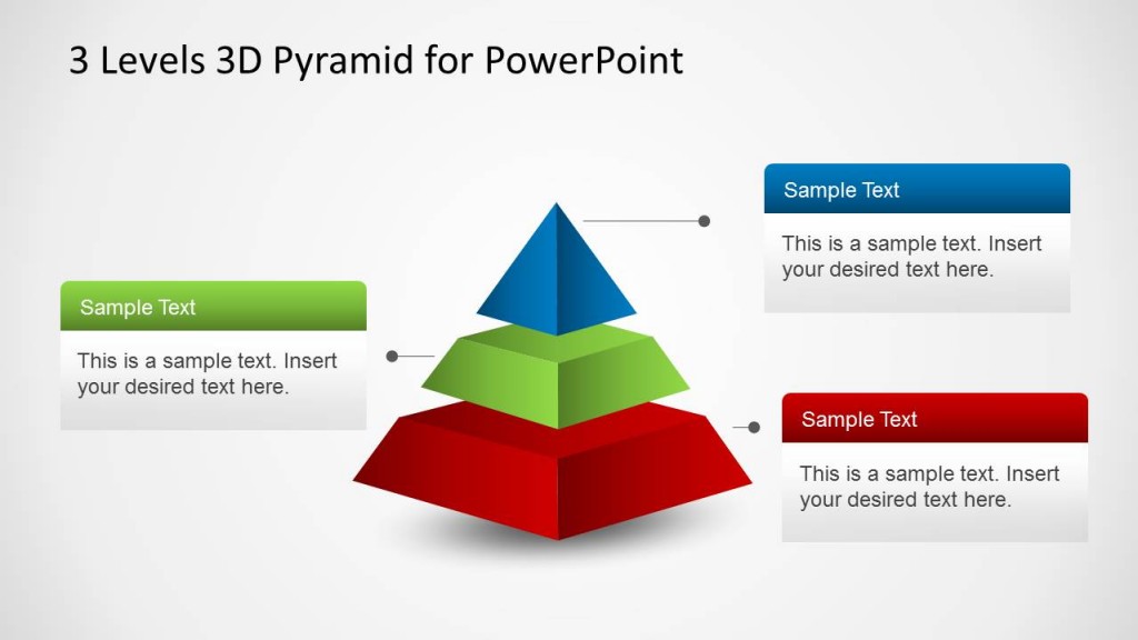
1. Minto Pyramid Principle PowerPoint Template
Use This Template
2. 3 Levels 3D Pyramid Template for PowerPoint
Like this article? Please share
Communication, Communication Skills, Presentation Approaches, Presentations Filed under Presentation Ideas
Related Articles

Filed under Business • July 24th, 2024
How to Create a Demo Presentation
Discover the secrets behind successful demo presentations and what they should contain with this article. Recommended PPT templates included.

Filed under Presentation Ideas • July 17th, 2024
How to Convert a Text Document into a Presentation with AI
One of the biggest challenges for presenters is to summarize content from lengthy reports, academic papers, or any other kind of written media in an informative and concise way. Rather than losing countless hours going over and over the same text, we can speed up the process thanks to the virtues of artificial intelligence. In […]

Filed under Google Slides Tutorials • July 15th, 2024
How to Export Trello Board to Google Slides
In this article you will learn how to export Trello Boards and convert them instantly into Google Slides, in a step by step tutorial.
Leave a Reply
A Beginner’s Guide To Presentation Design [+15 Stunning Templates]
![A Beginner’s Guide To Presentation Design [+15 Stunning Templates]](https://www.peppercontent.io/_next/image/?url=https%3A%2F%2Fwordpress.peppercontent.io%2Fwp-content%2Fuploads%2F2022%2F02%2FThe-beginners-guide-to-presentation-design.png&w=1536&q=75 "presentation drawing principle")
Table of Contents
- What Is Presentation Design?
What Is the Significance of Presentation Design?
Understanding various forms of presentations.
- 10 Tips to Create a Compelling Presentation Design
5 Inspirational Presentation Design Trends
- 15 Best Presentation Design Templates to Consider
- Key Takeaways
- Conclusion
Once you’ve mapped out your presentation, it’s time to tackle the intimidating task of creating a visually stunning presentation design . Creating an excellent presentation design becomes simpler by learning and adhering to fundamental presentation design standards. Here is a presentation design guide to creating an engaging and well-designed presentation, regardless of the kind of project you are putting together.
What Is Presentation Design?
Presentation design focuses on the visual facet of your presentation to captivate your audience. An outstanding presentation design may significantly impact your target audience, whether it is investors, employees, collaborators, or potential customers. The design must ideally complement the material of your presentation to help get your views across and convince your audience.
Creating a presentation for the first time to present in a professional setting or to a large audience might feel challenging. This guide to presentation design will walk you through the elements required for building a visually appealing presentation.

A presentation is much more than just a layout of slides with text and graphics on them. You need to make sure it’s visually appealing too. It is mainly because visuals are much more engaging than written words in your presentation slides. Presentation design is crucial because it allows you to combine your ideas, narrative, graphics, facts, and statistics into one cohesive tale that drives your audience to the decision you desire.
A robust presentation design may unlock doors you never imagined could be opened. An effective design is much simpler to understand and earns a lot of credibility for your brand. You can communicate your message effectively, encourage your audience to take subsequent actions, and get them to engage with what you’re saying with excellent presentation design.
You have the potential to communicate your point of view, create a brand identity, and get your audience to see and hear you loud and clear when you build a presentation with impeccable design. The material of your presentation is crucial to your project’s success, but a poor design may divert the listener’s attention (and not for a good reason). Don’t let a lousy presentation design force you to lose out on a huge business opportunity.
Creating a winning presentation design involves combining design components to produce slides that will neither bore nor exhaust your audience. Instead, it will engage and inspire them effectively. So, instead of creating a lousy presentation using shoddy designs, it is significant to master the fundamentals of creating the best presentation design.
Presentations may be used for several purposes and can come in different forms. A quarterly sales presentation with your team will not be the same as a presentation focused on employee training.
In the first scenario, you’ll strive to advance your team to achieve targeted sales growth. In the second, you’ll focus on imparting essential knowledge and skills to your employees. Looking at some of the most prevalent presentation types can give you a better idea about presentation design and when to begin constructing your own.
1. Investor pitch presentation
Using facts to convince rather than enlighten is the primary goal of this presentation style, as indicated by the name. If you’re a startup or a small firm looking for investment, you’ll need to use this form of presentation to your advantage. An investor pitch presentation will be required when you’re explaining your company’s user acquisition growth rate to prospective investors. Such presentations are created using the classic pitch deck concept to make the perfect, thoroughly professional pitch.
2. Educational presentations
Educational presentations are sometimes misunderstood as informative presentations since they are designed to teach viewers new skills and educate them on a new subject. You may need to produce a presentation for a school for various reasons, such as presenting an idea or providing an academic report.
Academic and corporate training programs often employ this presentation format. A video tutorial with comments and suitable themes may be added to the slides to improve them. Educators are always looking for new and unique methods to provide engaging and enthralling presentations for their students. Using an educational presentation template may guarantee that your presentation is visually appealing as well as easily comprehensible.
3. Webinar presentations
Webinar presentations are the newest craze, and they’re a win-win for presenters and the audience alike. A webinar refers to an online presentation, but unlike a video posted elsewhere, the webinar takes place in real-time and with the active participation of the audience. There are several themes and settings for which webinar presentations might be utilized.
Short surveys, quizzes, and Q&A sessions let participants feel more involved in the webinar. Most commonly, a webinar is meant to disseminate information, but it may also act as a marketing tool, a source of leads, or a way to generate new sales and sign-ups.
4. Report presentations
A report presentation is intended to offer the necessary information to those engaged in a process or project. Report presentations are critical in ensuring these stakeholders that the procedures that must be followed for the project’s completion are effectively planned and executed. Sample reports are also accessible to these stakeholders.
A report presentation may take numerous forms, such as a business report or an infographic. Reports on sales and marketing performance, website statistics, income, or any other data that your team or supervisors wish to know about can be presented during the report presentation.
5. Sales presentations
Sales presentations are often the initial phase in the sales cycle, and are, therefore, critical. A sales presentation, often known as a sales pitch deck, is a form of presentation you would need to provide a prospective customer or client with when pitching a product or service.
Not every sales presentation is designed to close a deal right away. The goal might be to pique the curiosity of the people concerned. Sales presentations often include your company’s unique selling proposition (USP), product price points, and testimonials. Your sales presentation must be engaging and successful in influencing potential customers, using a well-thought-out approach.
6. Inspirational presentations
An inspiring presentation is a standard tool used by managers, team leaders, motivational speakers, and business owners to stimulate and encourage their audience. Inspirational presentations are essential to influencing others and achieving your individual and business goals.
To get a desirable result from this kind of presentation, elicit an emotional response from the audience and motivate them to act. Using a presentation template that has been professionally developed provides you with an advantage over others.
7. Keynote presentations
Keynote presentations are given in front of a larger audience. A good example can be those shown at TED Talks and other conferences. While the presenter gives the entire speech, there are advantages to using slides, such as keeping an audience engaged and on track.
10 Tips to Create a Compelling Presentation Design
If your presentation is lousy, you might come across as unprepared, uninterested, and lacking any credibility. A well-designed presentation makes you appear reliable and competent. Here are some fantastic points to help you develop the best presentation design.
1. Outline your content and fine-tune the message
It’s crucial to prepare your content and fine-tune your main message before you begin developing your presentation. Try to figure out what your target audience wants to know, what they may already know, and what will keep them engaged. Then, when you create your presentation’s content, keep those things in mind and furnish designs accordingly. It is vital to remember the key takeaway of each deck you create.
Too much information shown on a single slide is difficult for most viewers to comprehend. Make sure you don’t overwhelm your viewers; each presentation slide should include no more than one key point. Make your information as brief as possible, yet make it detailed enough and valuable.
2. Use more visuals and less text in your decks
Your audience recalls information considerably better when images complement it because they can better understand visual features than simple text. Presenters that employ images instead of words get more favorable feedback from their audience than those who rely only on text.
Using visual examples in slide decks increases audience engagement, encourages more questions, and registers your message in the minds of your audience. Remove any unnecessary text from your slides and replace it with visuals that will engage your audience.
You may use various methods for adding images, but the most common is using your data’s visual representation. It’s important to note that adding visuals does not mean sprinkling fancy images and symbols across your slides. Relevant images and iconography are a must.
3. Limit the use of fonts and colors
It is vital to pay attention to color schemes and other design components, such as fonts, to ensure your presentation succeeds. Although it may be thrilling to employ as many fonts and colors as possible, the best presentation design practices imply that you should only use two or three colors overall. Also, make sure the content in your slides is of a different font than the headers.
When it comes to color schemes, certain combinations work better than others. When choosing colors, keep in mind that they should not detract from the message you want to convey. Add an accent color to one or two of your primary hues for a cohesive look. It’s critical that the colors you choose complement one another and communicate your purpose effectively. Headers should be in one typeface, while body content should be in another. Add a third font for the accents, if you’d like.
4. Create a visual hierarchy
Visual hierarchy is an important consideration when including text in a presentation. Visual hierarchy is one of the most significant but underappreciated presentation design principles. Color, size, contrast, alignment, and other aspects of your slide’s elements should all depend on their value.
When creating a visual hierarchy, you must clearly understand the story and its structure. Your audience’s attention should be drawn to the most critical components first, then to the second-most essential aspects, and so on. When creating your presentation, think about the story you want to tell and the visual hierarchy you need to support it. If you do this, the essential ideas you wish to convey will not be lost on your audience.
5. Incorporate powerful visuals
It is important to use visual aids to make a compelling presentation: think images, icons, graphics, films, graphs, and charts. You should also ensure your slides’ aesthetics accurately portray the text they contain. Alternatively, if you don’t have words on the slide, make sure the visuals mirror the words you’re saying in your speech.
Visual aids should enhance your presentation. In addition, you’ll want to ensure that your slide has some form of visual representation so that you’re not just dumping a bunch of text onto a slide.
6. Avoid using bullet points
These days, any excellent presentation design instruction would encourage you to avoid bullet points as much as possible. They’re dull and old-fashioned, and there are more effective methods to display your material.
A slide consisting of icons, images, and infographics is more exciting and conversational than one written in list form. Using bullet points for each slide’s primary theme is a standard PowerPoint design recommendation that you should refrain from while designing your presentation.
7. In group presentations, segregate slides by theme
While making a group presentation, finding an appropriate balance of who should be demonstrating which presentation segment is often challenging. Arranging a group presentation by topic is the most natural technique to ensure that everyone has an opportunity to speak, without the presentation becoming incoherent. Your group presentation should be divided into sections based on the subject.
Prepare your presentation ahead of time so that everyone understands when it’s their turn to talk. It’s up to each person in the group to pick one thing to talk about when they give this presentation to investors or potential customers. For instance, the business model slide may be addressed by one person, while another can discuss the marketing approach.
8. Maintain consistency
Consistency is essential when you work on the design of your presentation. Your presentation is still one presentation, no matter how many slides it has. Design elements, color schemes, and similar illustrations can all be used to achieve design consistency.
Although some of the slides in your presentation may appear to be styled differently than the others, the overall presentation must be held together by a single color scheme. To ensure that your viewers don’t lose track of what you’re saying, make sure each of your slides is visually connected.
9. Emphasize important points
It is pertinent to use shapes, colorful fonts, and figures pointing to your material. They help emphasize vital information to make it stand out. This not only keeps the reader’s attention on the page but also makes your design more streamlined. Emphasizing the point you’re trying to put across with visual elements makes it easier for your audience to grasp what you’re saying.
10. Integrate data visualization
Consider utilizing a chart or data visualization to drive your argument home, especially if you have vital figures or trends you want your audience to remember. This might be a bar graph or a pie chart that displays various data points, a percentage indication, or an essential value pictogram.
Confident public speaking mixed with good visuals may greatly influence your audience, inspiring them to take action. The use of design features makes it simpler for your audience to grasp and recall both complex and fundamental data and statistics, and the presentation becomes much more enjoyable too.
Even though trends come and go, effective presentation design paired with some inspiration to get you started will always be in style. Think about what’s current in the world of graphic design before you create a staggering presentation deck for a creative proposal or a business report. To help you better, we’ve come up with a list of the most popular presentation design concepts.
1. Dark backdrops with neon colors
While white backgrounds have long dominated web design, the advent of “dark mode” is gradually altering that. Designers may use dark mode to play with contrast and make creative things stand out.
This is a great way to get your audience’s attention and keep them interested in what you have to say. The key is to pick one or two bright colors and utilize them as highlights against a dark backdrop, rather than using an abundance of them.
2. Monochromatic color schemes
In recent years, color schemes originating from one base hue, such as monochromatic color schemes, have been given a subdued pastel makeover. The usage of monochromatic color schemes in presentation design is always seen as clean and professional. It’s ideal for pitch decks and presentations since monochrome is generally utilized to assist people in concentrating on the text and message, rather than the colors inside a design.
3. Easy-to-understand data analysis
The fundamentals of data visualization should be restored. In other words, even the most complicated measurements may be made easy to grasp via effective design. Designers, marketers, and presenters are generating snackable stats in the same way infographics have found a place on visual-first social networks.
Create a dynamic proposal or presentation with the help of an infographic template that is easy to use. You can create distinctive slides with animations and transitions to explain your point more effectively. With the help of templates, you can convert your data into bar graphs, bar charts, and bubbles that represent your idea simply, guaranteeing that every data point is simple to comprehend.
4. Straightforward minimalism
Minimalism is a design trend that will probably never go out of style. It has always been a show-stopper. Each slide should offer just enough information to let the reader comprehend what’s going on. You should use a color palette that isn’t distracting. Your simple presentation will enthrall your audience if you boldly highlight your most significant points and use trendy fonts.
5. Geometric structures
There’s a good reason why designers are so fond of geometric patterns, 3D objects, and asymmetrical layouts. They’re basic yet stunning, making them perfect for times you want to make a lasting impression with the information you’re sharing.
More cutting-edge components, such as 3D shapes and floating objects, are used in presentation graphics these days. Go for a presentation template that contains editable slides that enable you to easily add your visuals and material to brighten your presentation.
15 Best Presentation Design Templates to Consider
In the case of presentation designs, you should never sacrifice quality. Ideally, you should have a design that improves your brand’s image, amplifies your message, and enables you to deliver various content forms efficiently.
The problem is, it’s pretty challenging to locate premade themes and templates of this merit. We’ve made it easy for you by putting together a list of the best 15 presentation design templates out there. These presentation design suggestions are a great place to start.
1. Business plan presentation template
This is a crucial business presentation template with a significant emphasis on visualizations and graphics. To create a business strategy, you need this presentation template. It consists of several crucial elements, such as a mind map, infographics, and bar graphics. Replace the placeholder text with your own to complete the presentation.

2. Pitch deck template
Startups seeking financing require a clean and eye-catching pitch deck design to impress investors. You may use it to present significant aspects and achievements of your company to investors. You can include slides for mockups, testimonials, business data like statistics, and case studies.
The pitch deck presentation template is excellent for your next client pitch, as it allows you to pick from a range of different startup tales to showcase the most crucial features of your firm.
3. Brand guidelines presentation template
Creating a bespoke presentation talking about the company dos and don’ts may be a terrific approach to discuss your brand rules with your team and stakeholders. You can easily show off your brand’s typeface and color schemes using this presentation template.
4. Marketing plan presentation template
Marketing is a vast concept, and the slides included in this design stock set reflect that broadness. A well-executed marketing strategy is essential to the success of any team. A marketing plan presentation template should ideally include slides for charts, timelines, and competition research. You can create executive summaries or mission statements with the below-mentioned presentation’s elegant and minimalistic slides.

5. Keynote presentation template
This keynote template has a lovely color scheme that is equal parts captivating and professional. You can employ a keynote presentation template if you’re going to be a keynote speaker at an upcoming event and want to ensure that your design stands out.

In addition to several slides, the template comes with various predefined color schemes. This template is perfect for any business presentation requiring a well-designed layout.
6. Training manual presentation template
A training manual presentation template may be used to convey new hire training to your workforce. It is essential for the design to be as clean and straightforward as possible.
These training material decks created with a predesigned template make it easy for new employees to learn the ins and outs of their jobs.
7. Case study presentation template
A case study is an excellent way to illustrate a point in your presentation. The best way to attract new consumers using a case study presentation is to show them how your existing customers are using your product or service. Make sure to highlight how your product solved their pain points.
8. Interactive brief presentation template
It’s common to provide a creative brief when working with a contractor, freelancer, or designer to ensure everyone involved understands what the final product should look like.
An interactive presentation template like a creative brief is a terrific concept for absorbing and memorizing that information.
9. Workforce handbook presentation template
When hiring a new employee, your company needs to create an employee handbook to ensure they know the company’s objective and general working norms. You may connect this presentation to your intranet or website, or just distribute the digital version through a password-protected or private link.
10. Ignite presentation template
Using this template as a starting point for an Ignite presentation would be ideal. An Ignite presentation is a five-minute presentation consisting of 20 slides, compelling the speaker to speak fast and concisely. As a result, an Ignite presentation template prevents you from using too much text on any slide.
11. Informative presentation template
The need to create an educational presentation may arise due to several reasons, such as onboarding new hires, explaining a concept to students, and more. An informative presentation template is a suitable solution in all cases.
Regardless of who they are meant for, presentations are the optimal format for sharing information with any audience. Create an educational presentation that you can embed in a blog post or publish on several platforms online. Make presentations to provide knowledge at conferences and other meetings.
12. SWOT analysis presentation template
A strength, weakness, opportunities, and threats (SWOT) analysis is a valuable tool for gauging where your business stands, and how your strategic planning measures are paying off. This presentation template is an excellent tool for SWOT analysis or refining your marketing strategy.
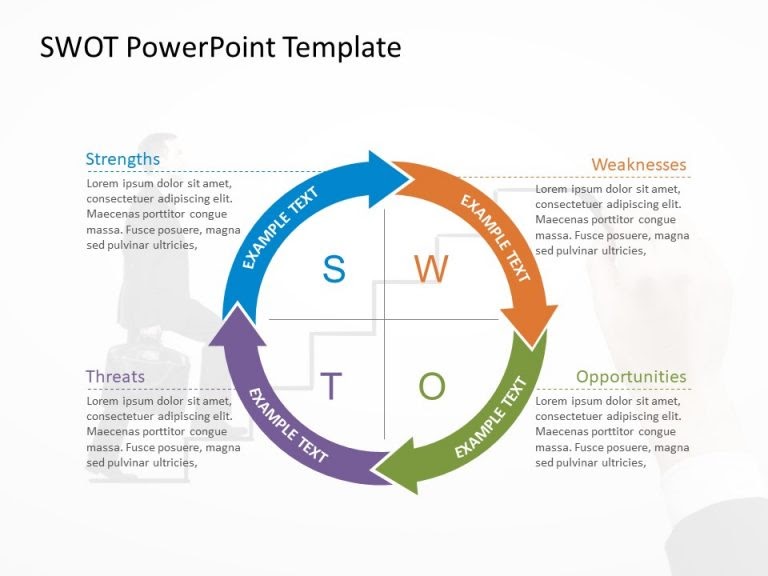
It comes in several formats; circular design and hexagonal shapes being two of them. You may modify the colors as desired.
13. Competitor analysis presentation template
Knowing your competition and what they offer is essential for a successful business. Competitor analysis means researching your competitors’ key strengths and weaknesses, which can, eventually, help you define your goals and USPs more clearly.
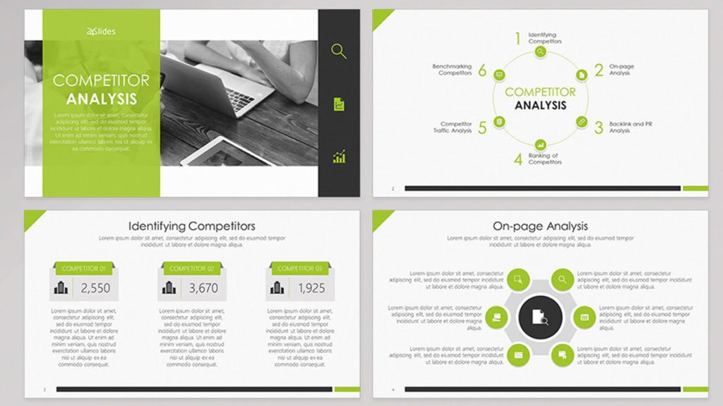
There are built-in interactive elements in this competitor analysis presentation template, which can help hook your audience.
14. Bold presentation template
Ideal for non-corporate sales presentations, a bold and daring presentation template includes slides with a vibrant, attention-grabbing theme that is neither overbearing nor distracting. The color combination is striking without being oppressive.
15. Company overview template
Creative presentation templates are all the rage today. Using a lot of negative space will allow your audience to take a breath and direct their attention to the most crucial parts of your presentation. It is suitable for corporate presentations, since it doesn’t stick out more than is necessary.
Key Takeaways
- Audiences tend to forget a large percentage of what was addressed before the presentation is through. This is why it is important to create a presentation design that is memorable.
- A presentation is much more than just a layout of slides with text and graphics on them. You need to make sure it’s visually appealing too.
- Use a wide range of best presentation design tools, components, and styles until you discover the one that resonates with your target audience.
- Consider the most recent trends and best practices, and dedicate time to thoroughly crafting every presentation.
- Fine-tuning your message, avoiding the use of bullet points, incorporating visual hierarchy, and incorporating data visualization are a few design tips to create a winning presentation.
Both your presentation style and design are crucial. You can deliver more dynamic, memorable presentations by creating visually pleasing decks. It’s advisable to create a resourceful presentation design if you want to elevate your personal as well as professional credibility.
Take cues from some popular presentation templates, and enhance one little aspect at a time. Now is the time to practice everything you’ve learned in this presentation design guide. As with any other visual communication, creating the best presentation design requires time, effort, and patience. Never be afraid to try something new; you’ll quickly see the benefits a strong presentation can have on your project.
A presentation design puts ideas, tales, words, and pictures into a series of slides that convey a narrative and engage your audience.
A presentation design template is used to achieve a uniform look for your slides. Templates are pre-made presentations into which you may insert your data.
People remember images and words better than just words. The design of your slides should be simple and consistent. This way, your audience will focus on the most important points.
Use high-quality images to back your message, but don’t use too many special effects. Make sure you don’t read from your slides.
A well-presented, memorable introduction and conclusion are two essential parts of a presentation. Don’t forget them when you write your outline.
Presentation design is essential, because it helps you weave your ideas, narrative, images, facts, and statistics into a unified story that leads your audience to the choice you want them to make.
Latest Blogs
In this blog, explore the golden rules of using AI marketing tools so you can leverage the benefits to their maximum potential.
In this blog, you’ll learn how to avoid the pitfalls of SEO over-optimization while enhancing your site’s performance.
In this article, we’ll take a look at what AMP is, its advantages and disadvantages, and how it affects SEO.
Get your hands on the latest news!
Similar posts.

7 mins read
15 Best Firms Offering Design Services in India

5 mins read
All You Need to Know About Data-Driven Design

6 mins read
Decoding Design Communities and Their Advantages
👀 Turn any prompt into captivating visuals in seconds with our AI-powered design generator ✨ Try Piktochart AI!
Presentation Design: A Step-by-Step Guide

Nailing your presentation structure can have a big impact on your target audiences, whether they are investors, coworkers, partners, or potential customers. It helps get your ideas across and persuade others.
For a presentation to work, its contents must be paired with great design. In fact, 91% of presenters feel more confident with a well-designed slide deck.
Now, design may not be something that interests you or something you’re good at. But like it or not, the moment you fire up Powerpoint, or Keynote you are a designer. And there is no escape.
So instead of designing a poor presentation with lousy templates, why not learn the essentials of designing a beautiful presentation?
In this guide, we’ll discuss how to design a captivating presentation, and break down the whole process into small chunks so you can tackle each step easily.
If you’re eager to put these principles into practice, create a Piktochart account and start creating beautiful presentations in minutes.
What makes a presentation well designed?
A bad presentation can give the impression that you lack preparation, care, and credibility. A well-designed presentation, on the other hand, makes you look professional and trustworthy. Here’s what it means:
Less text and more visuals
Humans are visual beings. Our comprehension of visual elements is way more than just plain text. And we retain any information much better when it’s paired with imagery.
If you want your message to connect with your audience, remove the extra text in your slides and replace it with visual content .
There are many ways to add photos , one of which is visualizing your data into timelines , flowcharts, graphs , and other frameworks. For example, this presentation by Trinh Tu uses data visualization really well to convey key stats and details.

However, adding visuals doesn’t mean just throwing some fancy pictures and icons onto your slides. Your icons and photos need to be relevant.
Before you add a visual element, always check if it contributes to the message you are trying to communicate.
Well-placed pictures can go a long way in helping the audience connect with your presentation. So use them cautiously and strategically.
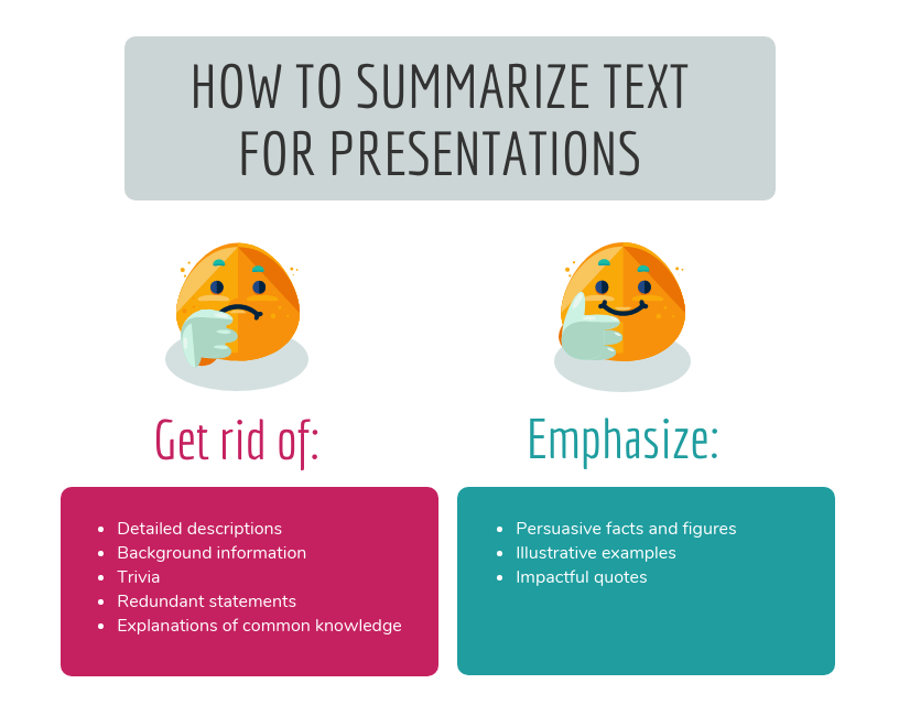
Summarize points instead of writing them all out
According to a survey by David Paradi , the three things that annoy audiences most about presentations are:
- Speakers reading their slides
- Slides that include full sentences of text
- Text that is too small to read

Notice what’s common to all these annoyances? The text. People have extremely short attention spans, especially when it comes to reading heaps of text.
So the text in your presentation slides should be just enough to complement the speaker, no more. It should not compete with what’s being said.
For example, this simple presentation does a great job of summarizing the message of each slide in just a few words and breaking up the text nicely into multiple slides.

Crowding your slides with all the information you have makes you unnecessary. You don’t want people to be distracted by reading when they’re trying to listen to you.
Instead, the slides should only be considered as a visual aid. So keep them simple. Focus on the message, not the slides themselves.
One takeaway per slide
As we discussed, people find it hard to absorb too much information from a single slide. So don’t overwhelm your audience, and remember that less is more. Make sure not to have more than one key point in each presentation slide.
For example, this presentation about startup weekend has minimalistic slides walking viewers through one message at a time. It also shows that you don’t need a ton of fancy elements to make your presentation visually appealing.

Limit each of your slides to a simple statement, and you’ll easily be able to direct your audience’s focus to the main topic and subtopics.
Arranging your text this way is one of the best ways to make a powerful impact on your presentation design.
Clear hierarchy in design
Visual hierarchy is easily one of the most important yet most overlooked design principles. Simply put, it means the color, size, contrast, alignment, and other factors related to each element of your slide should be based on its importance.
The most important elements should capture the attention of your audience first, followed by the second most important elements, and so on.
Needless to say, you must know the whole narrative and outline before you start planning the visual hierarchy. It’s all about the message you want each slide and your whole presentation to get across.
For example, in this presentation about building a good team, see how the header text, the description text, and the button text are different from each other. The header font is the largest and placed at the top, catching immediate attention.
Then your eyes go to the button text because it captures attention with a red background. And finally, you see the description, the illustration, and other elements.

So as you design your presentation, consider the narrative and plan the visual hierarchy needed to justify the story. This will ensure that your audience will not miss out on the key points you want to emphasize.
Design consistency across slides
People are quick to identify inconsistencies in a presentation design, and these inconsistencies prevent them from having a fully engaging experience. So keep your presentation design consistent with a single theme.
Consistency creates a better flow and shows that each slide in your presentation belongs to the same story. To understand this better, see the below slide from this presentation .

Notice how the slide primarily uses only two colors (white and red) for all the elements. And the image dimensions, fonts, and styling for each team member are exactly the same.
You’ll notice the same thing in other slides of this presentation too. The same colors, the same font family , and similar backgrounds have been used in the overall design . This is what we mean by consistency.
If the presentation you’re making is part of a company, the company may already have a style guide that dictates how to keep your presentation consistent with the company’s branding. If not, it’s never too late to create one .
Call to action
A presentation is not complete without a call to action (CTA). If there is no CTA, your audience will think, “Is that it?” and you’ll leave them wondering what they’re supposed to do next with the information you provided.
The best CTAs are simple and easy. For example, you can ask the audience to contact you, connect on social media, sign up for a product or webinar.

Also, make sure to highlight the incentive. Your audience should be clear on the main benefits they will get by following through with your call to action.
The bottom line is: Make it a no-brainer and make it easy for people to take action right away.
Designing a great presentation
Now that you know the ingredients of appealing presentation design, let’s see how to design a presentation that wows your audience, and also drives your key points home at the same time. Follow the below presentation, ideas, steps, and best practices to create a stunning presentation.
Prepare slide backgrounds and images
Backgrounds and pictures go a long way in setting the right mood and feel for your presentation. And there is no one right way to do this. Your options are limited only by your creativity.
For example, this presentation from Zuora makes masterful use of background images. Almost every slide has a beautiful background photo, along with a color overlay above the background to make the text easy to read.

Pay attention to the following best practices as you work on your backgrounds and photos:
- Make sure your images have enough contrast with your words.
- Use simple images that are closely relevant to your messages. You can use multiple free and paid stock photo sites to find photos that resonate with what you want to convey. These include Picography , Unsplash , Freepik , and Gratisography .
- Don’t pick common, generic stock images that people have already seen hundreds of times elsewhere. Also, avoid clipart for the same reasons.
- Don’t crowd too many pictures into a single slide.
- Ensure that your images are of high quality, with a resolution that allows a comfortable viewing experience. They should come off as clear and crisp on both small and large screens.
Zero in on your slide layouts
Contrary to what you may believe, great presentation design is not about being very artistic or creating complex layouts. Instead, your focus should be on communicating information in a nice, user-friendly way.
For example, this presentation has many slides that emphasize a great alternative to the conventional approach of putting text over an image. It leverages a split-screen layout for each slide, resulting in clean and elegant quotes paired with stunning visuals.

Pay attention to the following best practices as you work on slide layouts:
- Make sure you have a reason for aligning elements in a certain way for each slide. If possible, use frames or grids to align your images and text appropriately.
- When used too often, center alignment makes your design look amateurish. Use it only as a last resort.
- Don’t keep using the same layout for consecutive slides. It makes your presentation dull and repetitive. Mix up the layouts to keep your audience engaged.
- Have enough white space around each element. Don’t feel like you have to fill vacant spaces with more objects. Giving each visual room to breathe makes your whole design easier on the eyes, while a cluttered composition is hard to make sense of.
Pick your colors wisely
Colors influence emotions and contribute to the identity of your brand. They also lift the audience’s overall sense of enthusiasm and move people to action. So you must use colors strategically to pull the audience into your presentation.
For example, this colorful presentation for Adidas was designed to show how its deck could give a combination of fun and luxurious vibes.

Notice the colors used in the above slide. There is a lot of white, purple, and blue, with some variations used sparingly around the illustrations. Only three main colors are doing most of the heavy lifting. That’s why the overall design still works even with some extra colors thrown in.
Pay attention to the following best practices as you work on your presentation colors:
- If your company already has a color palette in place, stick to it. If not, pick a strong color scheme with no more than five colors to serve as a base for your presentation design. Too many colors can make your audience frantic.
- Use tools such as Adobe Color CC , Kuler , Piknik , and 0to255 to play around with different colors and color schemes and see what works with what.
- Make sure your color scheme has colors that can contrast and complement each other. Colors that don’t clash will make your presentation look clean and polished.
Select the right fonts
Typography is another factor that can make or break your presentation. Fonts have a subtle but powerful impact on how the audience views both your presentation and your brand.
But choosing fonts is a major challenge for those without any form of design education or experience. They mistakenly think that simple and basic fonts are too dull and boring. So they try to look for some fancy fonts to make their presentation exciting, eventually ending up with some hideous or outdated font such as Comic Sans.
Instead, you should consider the readability of the message you want to convey. For example, this presentation by With Company makes great use of modern typography .

Since many of the slides have lengthy quotes, they are split in ways to make the message easy to digest. In addition, see how all the text is super clean and concise.
Pay attention to the following best practices as you work on your presentation fonts:
- Just like with your color scheme, use the same set of fonts and the same font sizes in all the slides of your presentation. For example, if your slide heading is Verdana 40pt, then each slide heading should be Verdana 40pt. In fact, you don’t need more than three fonts that work well together.
- If you feel like using some animated text that bounces, soars, or glitters, just don’t. Curb the temptation. Hyperactive words and phrases are annoying and distracting.
- If you already have standard font pairs based on your company’s brand identity, use those. If not, choose fonts that convey the voice and tone you’re aiming for.
- The best fonts for presentations are simple, professional, modern, and readable. Pick a font such that there is a significant difference between its regular and bold font faces.
- Don’t shy away from using standard fonts. Avoid using some rare font that’s unlikely to be available on all computers and mobile devices.
- Pair fonts that work well with each other. Granted, this can be tricky and hard for an untrained eye to pull off. But there are many collections known to be effective. So you can pick from those. Resources like FontPair and FontJoy make it easy to find great font combinations.
- As discussed before, size the fonts based on visual hierarchy. For example, headlines should be larger than body text. But even the least significant texts should be large enough to read, with appropriate line and letter spacing.
Wrapping up
We know this may be a lot to take in. It’s not easy to design a mesmerizing presentation. But the final result is worth all the trouble. A great presentation can open doors that you may have never thought to be possible.
A clean design is much easier to take in. It makes you and your brand look more credible and professional. So use the above steps to push your design skills as far as you can.
Start improving one thing at a time, and your efforts will add up to a point where you’ll design stunning presentations without thinking. You can also accelerate the process with a tool like Piktochart that comes with hundreds of ready-made templates and intuitive features. So get started today.
About The Author
| Hitesh Sahni is a content strategy consultant, editor, and founder of , an upscale studio helping brands with superior content writing and marketing. Get his 5 essential to kickstart content creation for free. |

Other Posts

7 Sales Presentation Examples for Successful Pitches

Mastering the Craft: Presentation Design Strategies From a Pro

How to Make a Presentation (Guide With Tips & Templates)
Drawing From Observation
10 tips for better presentation slides.
Credit: http://blog.ted.com/10-tips-for-better-slide-decks/
Aaron Weyenberg is the master of slide decks. Our UX Lead creates Keynote presentations that are both slick and charming—the kind that pull you in and keep you captivated, but in an understated way that helps you focus on what’s actually being said. He does this for his own presentations and for lots of other folks in the office. Yes, his coworkers ask him to design their slides, because he’s just that good.
We asked Aaron to bottle his Keynote mojo so that others could benefit from it. Here, 10 tips for making an effective slide deck, split into two parts: the big, overarching goals, and the little tips and tricks that make your presentation sing.
The big picture…
- Think about your slides last . Building your slides should be the tail end of developing your presentation. Think about your main message, structure its supporting points, practice it and time it—and then start thinking about your slides. The presentation needs to stand on its own; the slides are just something you layer over it to enhance the listener experience. Too often, I see slide decks that feel more like presenter notes, but I think it’s far more effective when the slides are for the audience to give them a visual experience that adds to the words. .
- Create a consistent look and feel . In a good slide deck, each slide feels like part of the same story. That means using the same or related typography, colors and imagery across all your slides. Using pre-built master slides can be a good way to do that, but it can feel restrictive and lead to me-too decks. I like to create a few slides to hold sample graphic elements and type, then copy what I need from those slides as I go. .
- Think about topic transitions . It can be easy to go too far in the direction of consistency, though. You don’t want each slide to look exactly the same. I like to create one style for the slides that are the meat of what I’m saying, and then another style for the transitions between topics. For example, if my general slides have a dark background with light text, I’ll try transition slides that have a light background with dark text. That way they feel like part of the same family, but the presentation has texture—and the audience gets a visual cue that we’re moving onto a new topic. .
- With text, less is almost always more . One thing to avoid—slides with a lot of text, especially if it’s a repeat of what you’re saying out loud. It’s like if you give a paper handout in a meeting—everyone’s head goes down and they read, rather than staying heads-up and listening. If there are a lot of words on your slide, you’re asking your audience to split their attention between what they’re reading and what they’re hearing. That’s really hard for a brain to do, and it compromises the effectiveness of both your slide text and your spoken words. If you can’t avoid having text-y slides, try to progressively reveal text (like unveiling bullet points one by one) as you need it. .
- Use photos that enhance meaning . I love using simple, punchy photos in presentations, because they help what you’re saying resonate in your audience’s mind without pulling their attention from your spoken words. Look for photos that (1) speak strongly to the concept you’re talking about and (2) aren’t compositionally complex. Your photo could be a metaphor or something more literal, but it should be clear why the audience is looking at it, and why it’s paired with what you’re saying. For example, I recently used the image above—a photo of a container ship about to tip over (it eventually sank)—to lead off a co-worker’s deck about failure preparation. And below is another example of a photo I used in a deck to talk about the launch of the new TED.com . The point I was making was that a launch isn’t the end of a project—it’s the beginning of something new. We’ll learn, adapt, change and grow.
And now some tactical tips…
- Go easy on the effects and transitions . Keynote and Powerpoint come with a lot of effects and transitions. In my opinion, most of these don’t do much to enhance the audience experience. At worst, they subtly suggest that the content of your slides is so uninteresting that a page flip or droplet transition will snap the audience out of their lethargy. If you must use them, use the most subtle ones, and keep it consistent. .
- Try panning large images . Often, I want to show screen shot of an entire web page in my presentations. There’s a great Chrome extension to capture these—but these images are oftentimes much longer than the canvas size of the presentation. Rather than scaling the image to an illegible size, or cropping it, you can pan it vertically as you talk about it. In Keynote, this is done with a Move effect, which you can apply from an object’s action panel. .
- For video, don’t use autoplay . It’s super easy to insert video in Keynote and Powerpoint—you just drag a Quicktime file onto the slide. And when you advance the deck to the slide with the video that autoplays, sometimes it can take a moment for the machine to actually start playing it. So often I’ve seen presenters click again in an attempt to start the video during this delay, causing the deck to go to the next slide. Instead, set the video to click to play. That way you have more predictable control over the video start time, and even select a poster frame to show before starting. .
IMAGES
VIDEO
COMMENTS
Presentation drawing, also known as a rendering, is a crucial aspect of the design process. It's a means of visually communicating ideas to clients, colleagues, and contractors. Presentation drawings can take many forms, from quick sketches to highly detailed, realistic illustrations.
The basic principle is that the heavier (thicker) a line is, the more important it is. The graphics for the plan below are unacceptable because everything is represented with lines of the same thickness. From Ching, F.K., Architectural Graphics, 5th ed, p. 50.
The 4 Basic Principles of Presentation Design. Creating a beautiful presentation requires a symphony of visual elements to work together for a "big picture." Designers seek to make the entire vision work together in terms of how each part interacts.
The Pyramid Principle suggests that ideas should be presented as a pyramid. Using the pyramid structure, the information is grouped together with similar, low-level facts, drawing insights from the similarity, and forming a group of related insights. How is the Pyramid Principle used for Effective Writing?
Consider the most recent trends and best practices, and dedicate time to thoroughly crafting every presentation. Fine-tuning your message, avoiding the use of bullet points, incorporating visual hierarchy, and incorporating data visualization are a few design tips to create a winning presentation.
Design Principles for Presentations. Conceptual: Planning your presentation. • What is your main idea/argument? • What are your goals? • Who is your audience? • Determine the scope and tone of your presentation based on the main idea and audience. Aesthetic: Making your slides. Design CRAP. Contrast.
Part. 1: Presentation Design Principles. From choosing the perfect colors and fonts to leveraging simple design best practices (like “Grid systems”), you’ll learn exactly how to start your presentations off the right foot.
In this guide, we’ll discuss how to design a captivating presentation, and break down the whole process into small chunks so you can tackle each step easily. If you’re eager to put these principles into practice, create a Piktochart account and start creating beautiful presentations in minutes.
In this guide chapter, we'll explore the essential principles of presentation design. You'll learn how to select the right templates, maintain a consistent style, apply color theory, and choose...
Here, 10 tips for making an effective slide deck, split into two parts: the big, overarching goals, and the little tips and tricks that make your presentation sing. The big picture… Think about your slides last. Building your slides should be the tail end of developing your presentation.